Triggo.ai · T24 platform · Design lead for AI · 2023 to 2025
The assistant has to prove what it said
Triggo.ai built a platform where the person who understands the business publishes their own AI assistant, without going through engineering. It made the Top 10 LinkedIn Startups. The design problem was never making the model answer. It was making somebody trust the answer enough to put their name on it.
This case is about designing the parts no AI demo ever shows: the source, the scope, the error, and who carries the risk when the model is wrong.
- Role
- Design lead for the AI effort: experience architecture, design system, and the screens of three assistants built on the same core.
- Context
- A no-code AI platform, with clients in healthcare, fleet rental and heavy equipment rental. Product, engineering and data teams.
- Constraint
- The end user is not technical and has no patience for configuration. And a model error has real cost, from clinical guidance to a contract clause.
From a model promise to a product somebody signs off on
- 01
Framing
Translating what the model can do into something a business person buys. That step decides whether the rest exists.
- 02
One core
One assistant engine, three products on top. What changes between them is the source and the error bar, not the architecture.
- 03
Trust
Cited source, visible scope and answer evaluation. Without those, AI in a product is just expensive opinion.
- 04
System
A design system with components that stay readable when the answer arrives half done, or does not arrive.
- 05
Proof
Contract analysis clause by clause, with evaluation per clause and a field for the person to disagree with the model.
An AI demo shows the right question. A product has to survive the wrong one.
Every AI demo works. Somebody types the rehearsed question, the model answers beautifully, the room claps. What kills the project comes later, in the first week of real use: the answer came back confident and wrong, nobody knows where it came from, and the professional who took it to a client is the one who pays.
Across the three products I designed on that platform, users had exactly the same fear, phrased differently. The lawyer asked which clause that came from. The credit analyst asked whether it could be checked. The doctor asked who answers if it is wrong. That is not fear of technology, it is professional accountability.
I stopped designing the conversation and started designing the proof. The question driving the product became: what does this screen have to show for a person to disagree with the model with an argument?
Four decisions, and what each one killed
The answer came out without saying where it came from
The first version had the clean conversation everybody designs: question on one side, answer on the other. Elegant and useless, because the person who has to act on it has no way to check anything.
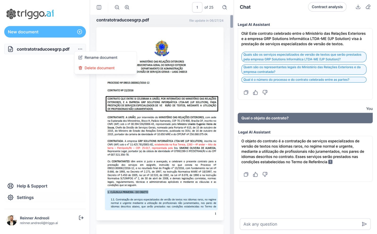
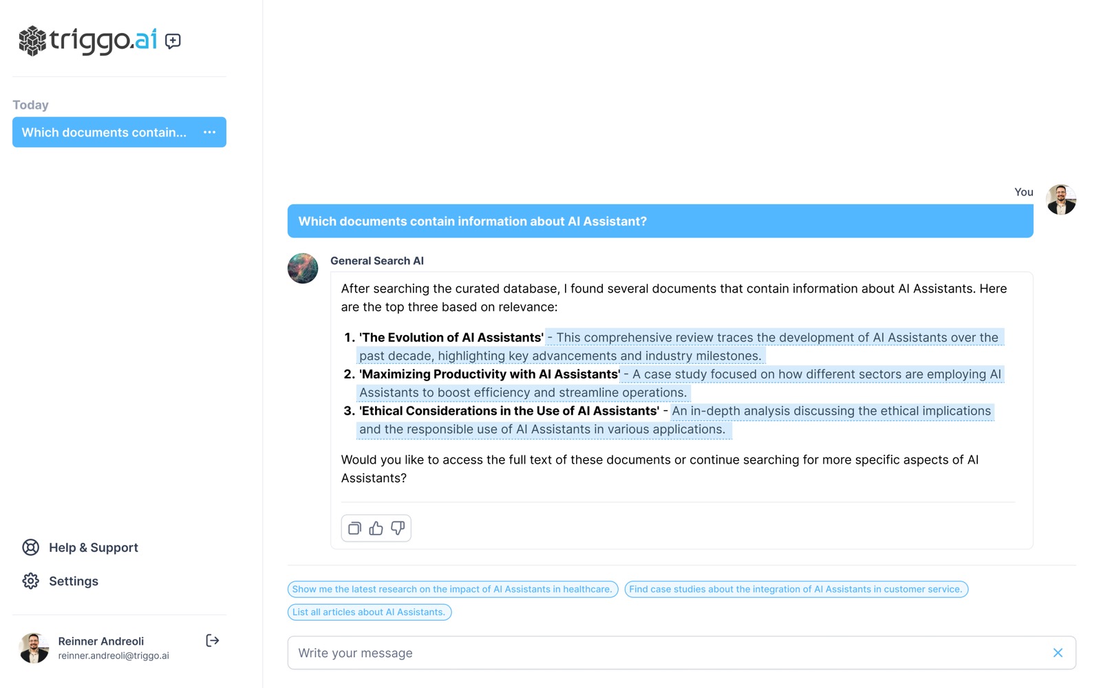
The answer started carrying a numbered reference to the source passage, with the document open alongside and the passage highlighted. In semantic search, the excerpt that supports the answer comes highlighted inside the result itself.
No answer ships without a source reference. It became a product rule, not a screen preference.
The clean conversation with no reference markers. It looks better in a screenshot and helps nobody decide anything.
A thumb at the end of the text does not say where the model got it wrong
The industry pattern is one like and one dislike under the whole answer. That measures mood, not accuracy: if nine paragraphs are right and one is wrong, a thumbs down throws away the nine and does not point at the tenth.
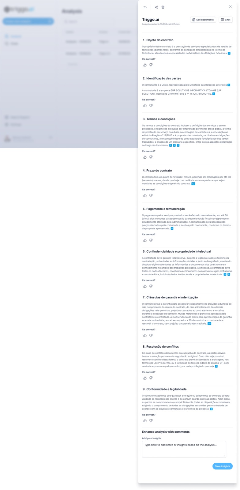
In contract analysis I broke the answer into named blocks, from the object of the contract to dispute resolution, and each block got its own verification question plus a field for the person to write what the model missed.
Evaluation per block, with nine clause blocks checked separately and room for the human to contradict the model.
The single thumb at the end, and the illusion that it produces improvement data.
Nobody knew what that assistant was allowed to answer
An assistant that promises to answer anything loses trust on the first topic it does not know, because the person had no way of telling that it was out of reach.
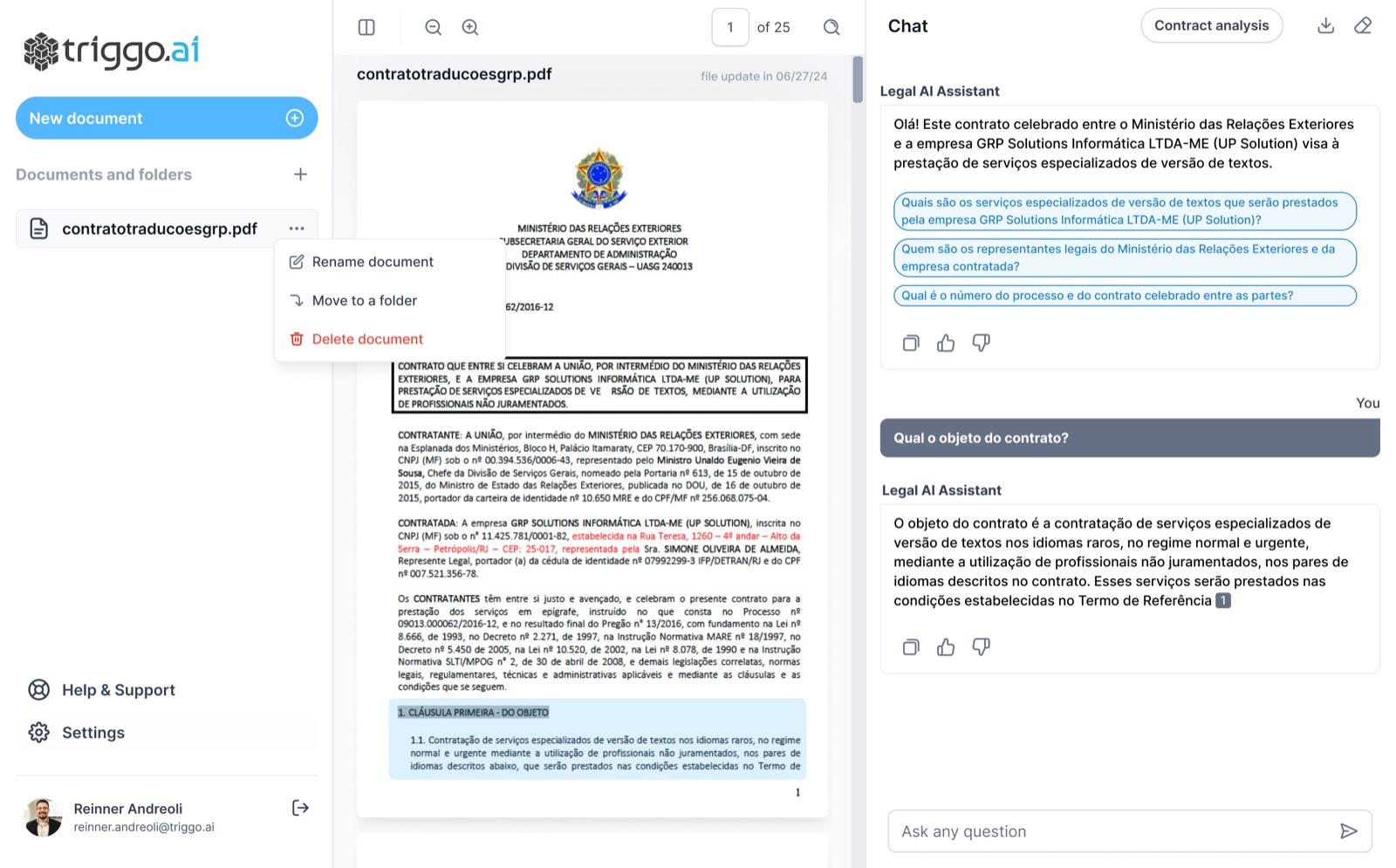
Documents and folders became a first class screen, at the same level as the conversation. The corpus the assistant can read is visible and browsable before anyone asks a question.
Explicit, browsable scope. The user sees the boundary of what the AI knows without having to discover it through an error.
The promise of an assistant that answers everything, which is exactly what kills trust in week one.
In the clinical product, anyone could ask
AI assisted clinical content open to any sign up is a regulatory risk and a human risk, in that order of embarrassment and the reverse order of seriousness.
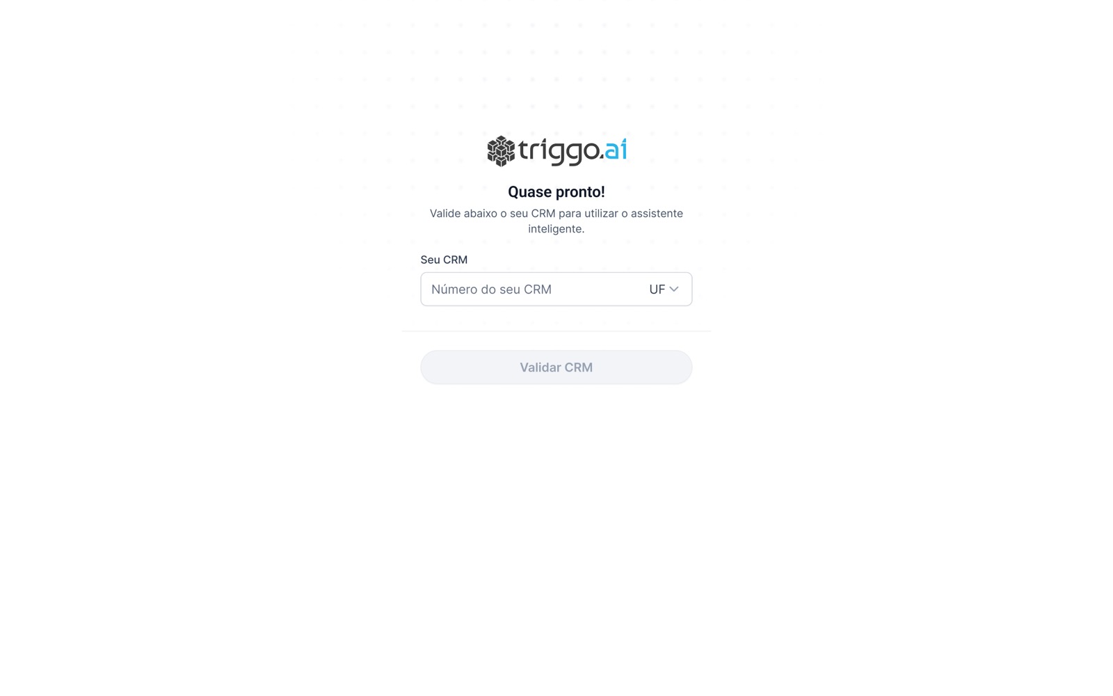
Professional registration checking moved to the door, before first access, rather than an optional profile field afterwards.
Verifying who is asking as part of the entry flow, with its own waiting and refusal states.
Open sign up with a disclaimer in small print, which transfers the risk to the user and solves nothing.
What those decisions became in the interface
What reached the client's hands
A note on method, because it matters to whoever is evaluating: the numbers above come from the artefacts and the screens, which I can show. Adoption and accuracy metrics in production stayed with the client, and I will not present a number here that I did not measure. What I defend is the decision and its trail in the interface.
What I would do next
- Close the evaluation loop: the correction a human writes in the insight field has to flow back into the assistant's knowledge, instead of dying in a text box.
- Use the per clause check as an accuracy metric by clause type, and prioritize what the model has to learn by what it gets wrong most.
- Expose cost and consumption to the administrator in the same place they already see usage, before the invoice rather than after.
- Usability testing with the people who sign off on the answer, not only with the people who buy the platform. Different people, different fears.
Trust in AI is not the model being right. It is being able to disagree with it.
I left this project with a conviction I carried into everything afterwards, including the product I run today: design work in generative AI is not in the answer, it is in the margin around it. Source, scope, limit, trail and the button to disagree. That is what turns a model into something a grown adult accepts using at work.
The uncomfortable corollary is that much of AI design is designing what the product will not do. Saying no clearly is harder than promising everything, and it is the only thing that survives the model's first mistake.